Many of our clients come to our design team to assist in implementing best practices for an ergonomic workplace. These projects help to drive workplace injury incidents down while driving employee and member safety and morale up. Healthcare facilities see a high rate of repetitive motion injuries so implementation of solutions that fit many body types properly and help reduce reach ranges can improve employee health and safety. One of Kaiser Permanente’s (KP) busiest local pharmacies is no exception, where an ergonomic upgrade presented an opportunity to elevate the staff and member experience with a welcome, colorful interior finish refresh.
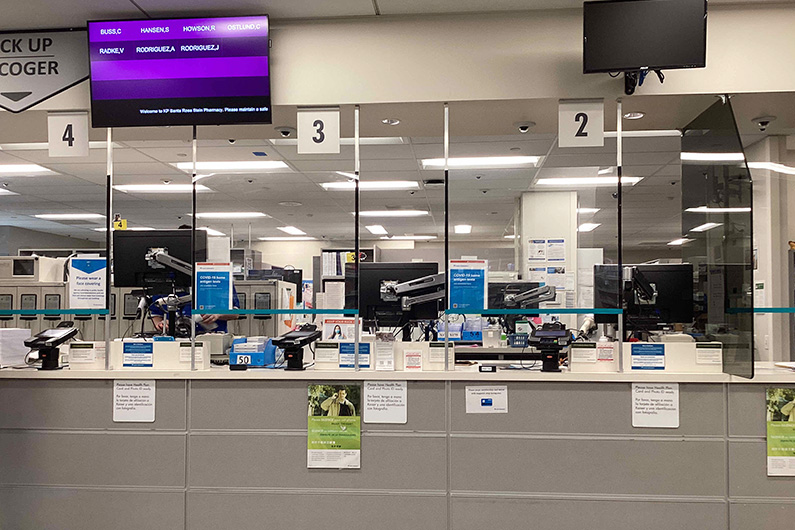
The scope included replacement of all point of sale and pharmacist workstations. Any project renovation for this client includes the application of current healthcare design brand standards color and material palette. The latest KP Brand Standards aim to evoke a mood of calm as well as inspire. The interior architecture and finishes are part of key experiences designed to create recognizable public amenities across facility campuses.

Early site meetings provided the opportunity to talk to pharmacy staff in person and explore spatial challenges and optimized workflow. The design team synthesized the staff input along with the best practice client standards to provide an ergonomic and better functioning space.
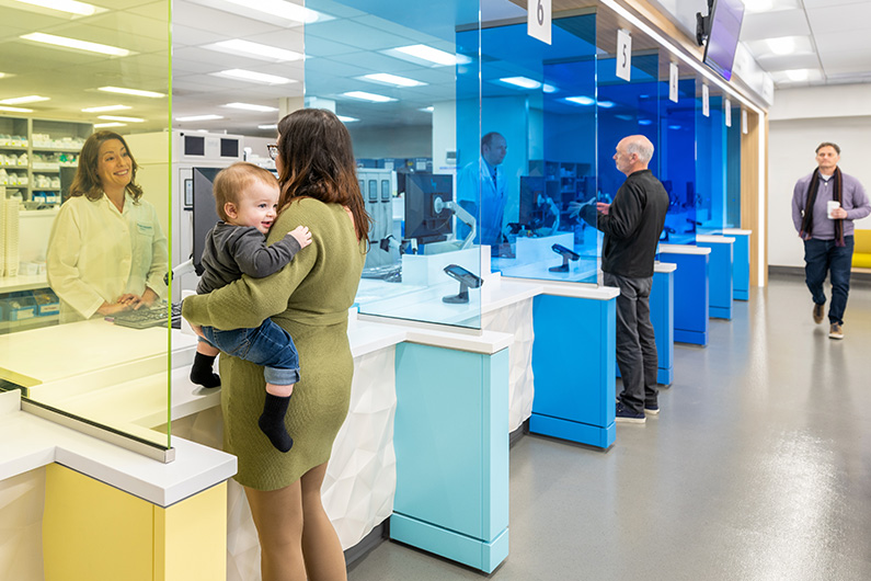
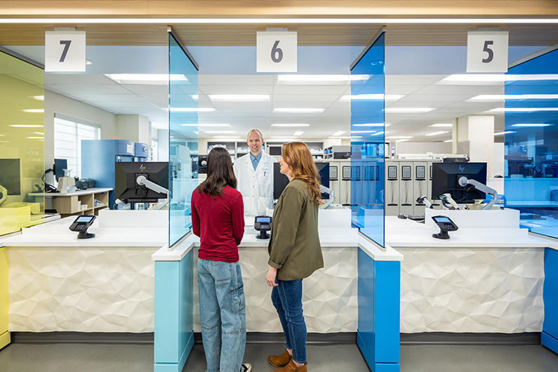
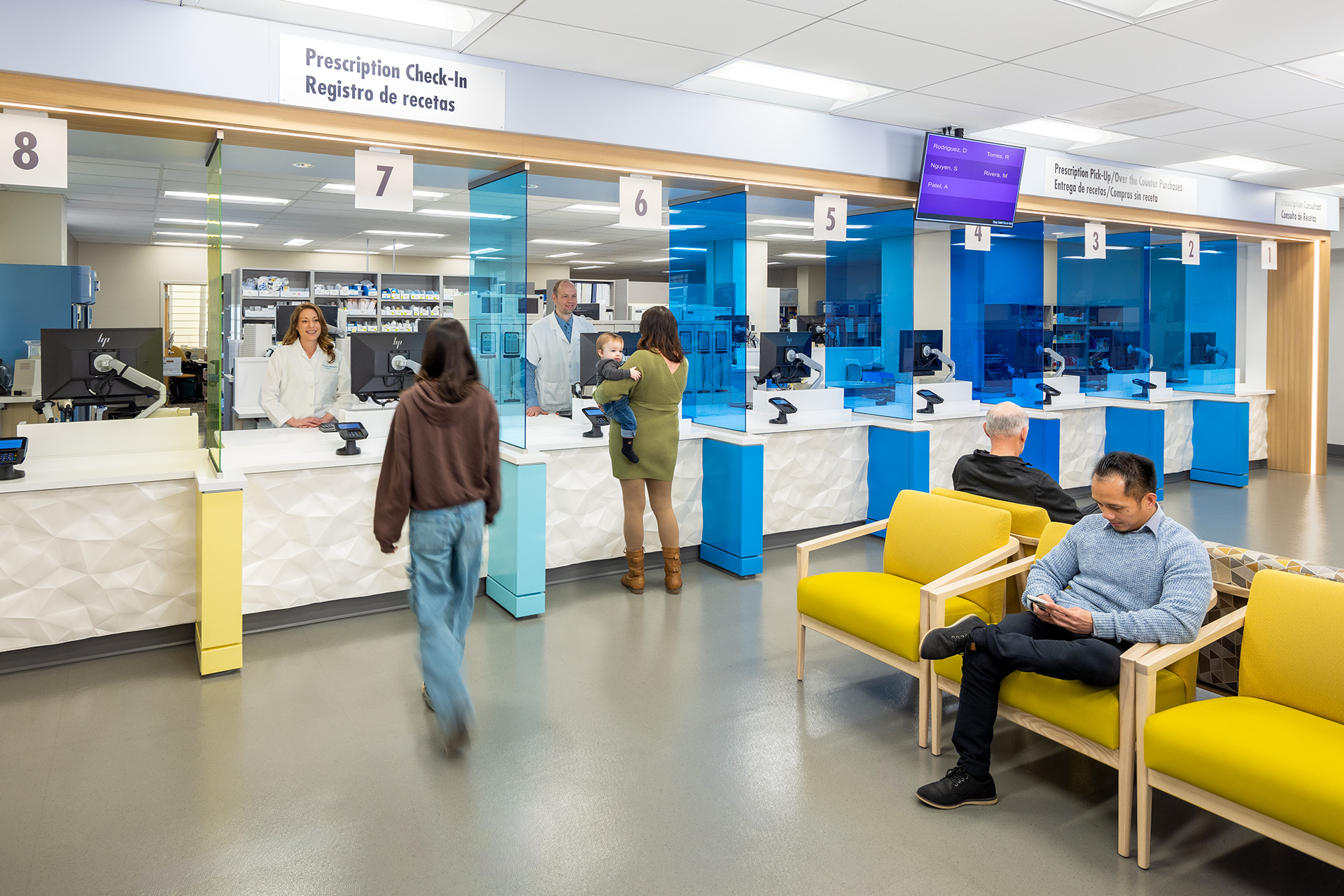
Executing the design direction involved detailed coordination for color matching materials between manufacturers. Transparent colored glass at the point of sale provides privacy between members at the service counter, while maintaining visibility for staff across the waiting room which achieves important security goals. From a design aesthetic and wayfinding perspective, this showstopper color draws members in from the main entrance.


Partial renovation projects such as this, require balancing the application of new finishes with adjacent existing conditions. It is the interior designer’s role to implement the brand standards but also advocate for what existing finishes should or can be maintained. In this case, the pharmacy flooring was in good condition and our team recommended it be cleaned for reuse instead of replaced. Making the choice to keep existing building finishes that are in good working condition is inherently sustainable. TLCD interior designers met with client leadership in the design development phase of the project to advocate for the finishes we believed would align with the new finishes, save the project money and be serviceable long-term.
Enhanced staff safety and comfort along with an improved healthcare experience for members makes this pharmacy refresh project a success story. The Kaiser Santa Rosa Pediatric Injection Clinic is another example of a colorful interior refresh in the same facility.

